


PROJECT: Circuitech Electronics Repair — Brand Identity Design
CLIENT: Circuitech
INDUSTRY: Technology / Repair Services
SCOPE: Logo Design, Branding
THE CHALLENGE
Circuitech came in sharp—new to the game, but ready to dominate. A modern tech repair service with brains and brawn, they specialize in fixing everything from phones and tablets to gaming consoles and full-scale systems. Their mission? Cut the confusion. Deliver smart, reliable tech repair with total transparency.
In an industry saturated with noise, they needed an identity that didn’t whisper—it had to command attention. Clean. Trustworthy. Unshakably confident.
THE GOAL
Build a logo that means business. One that fuses technical precision with a bold, human edge. The design had to scream reliability and innovation in one clean visual—no fluff, no filler. Just straight-up clarity and power.
The ask: sleek, black-and-white. Minimalist. Impactful.
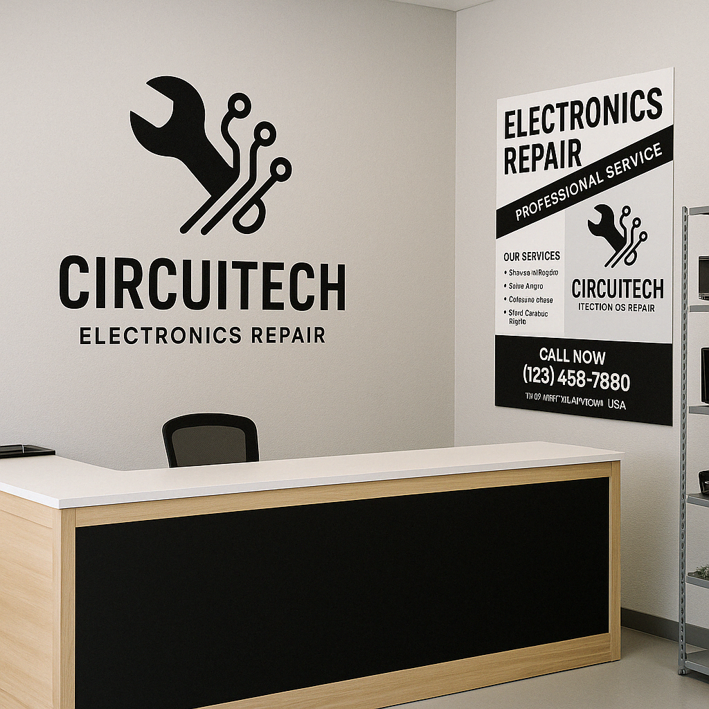
THE CONCEPT
At the heart of the design is a fusion of two powerhouse symbols:
The wrench — all about hands-on repair, grit, and technical skill.
Circuit lines — the digital pulse of modern tech.
These icons merge into one sharp, seamless mark that tells Circuitech’s story in a single glance. It's not just a logo—it's a statement: We know tech. We fix it fast. And we do it right.
Backed by a geometric sans-serif typeface that cuts through the noise, the identity is clean, bold, and razor-focused. The black-and-white palette? Purposeful. It keeps the brand flexible, timeless, and instantly recognizable across any medium.
THE RESULT
Circuitech’s new identity doesn’t play it safe—it plays to win.
It’s modern. It’s masterful. And it positions them as a serious force in tech repair—one that’s smart, skilled, and impossible to overlook.
Trust. Tech. Turnaround. Circuitech delivers. The brand now has the foundation to grow with confidence—and look damn good doing it.