


PROJECT TITLE: Bake House – Logo Design & Brand Identity
CLIENT: Bake House (Concept Brand)
INDUSTRY: Modern Artisan Bakery
THE BACKSTORY
Bake House isn’t just a bakery—it’s a movement. A bold, modern brand built on freshness, creativity, passion, and community. This is a place where Brookies (yep, that cookie-brownie masterpiece) are born, and where every bake tells a story. Bake House is all about innovation with soul—bringing people together, one unforgettable treat at a time. The mission? Bake with heart. Serve with purpose.
THE GOAL
Create a logo that speaks before it’s read. One that wraps you in warmth, invites you in, and leaves a mark. The brand identity had to balance indulgence with intention—playful, handcrafted, and impossible to ignore. From shelf to signage, this brand had to stand tall and stand out.
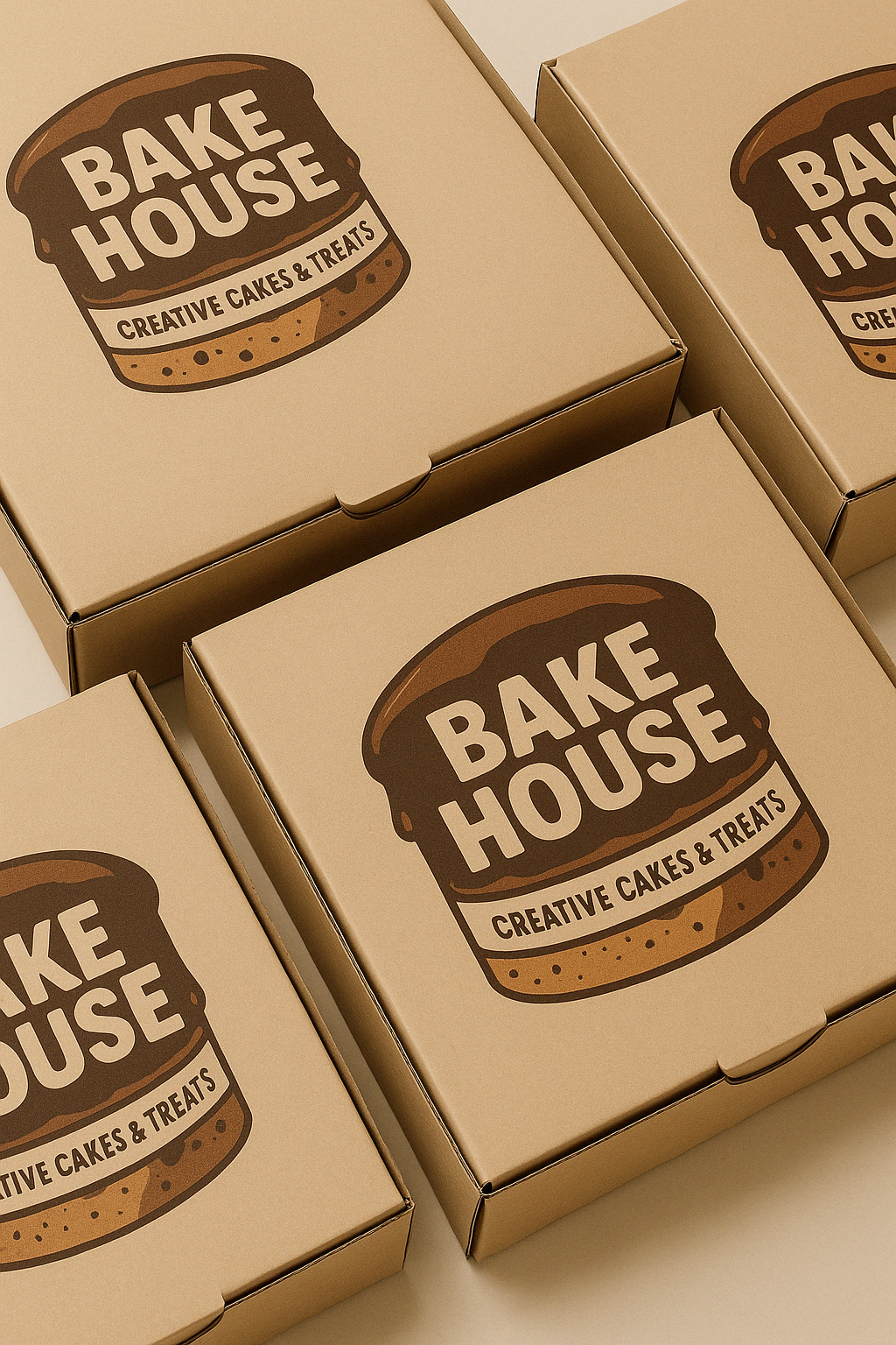
THE LOGO CONCEPT
Inspired by the iconic Brookie, the logo is stacked like a cake—layered with rich chocolate hues, soft textures, and a deliciously bold typographic treatment that looks like the name was baked right in. The typeface? Rounded. Welcoming. Confident. Just like Bake House itself.
The tagline “Creative Cakes & Treats” adds the final touch—grounding the brand in imaginative flair and high-quality craftsmanship.
THE RESULT
This isn’t just a logo—it’s an experience. The Bake House brand identity is playful, powerful, and packed with purpose. It turns heads, wins hearts, and works seamlessly across every touchpoint—from packaging to pastry boxes to the shopfront sign that says, "Welcome in. You’re home."
Bake House doesn’t follow the recipe. It rewrites it.