

SNACCIDENT – A Funk-Fueled Flavor Riot
Client: SNACCIDENT | Industry: Snack Food | Services: Brand Identity, Logo Design, Packaging, Concept Development
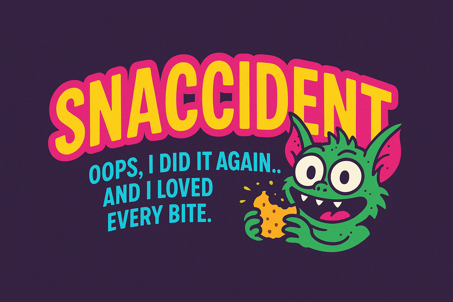
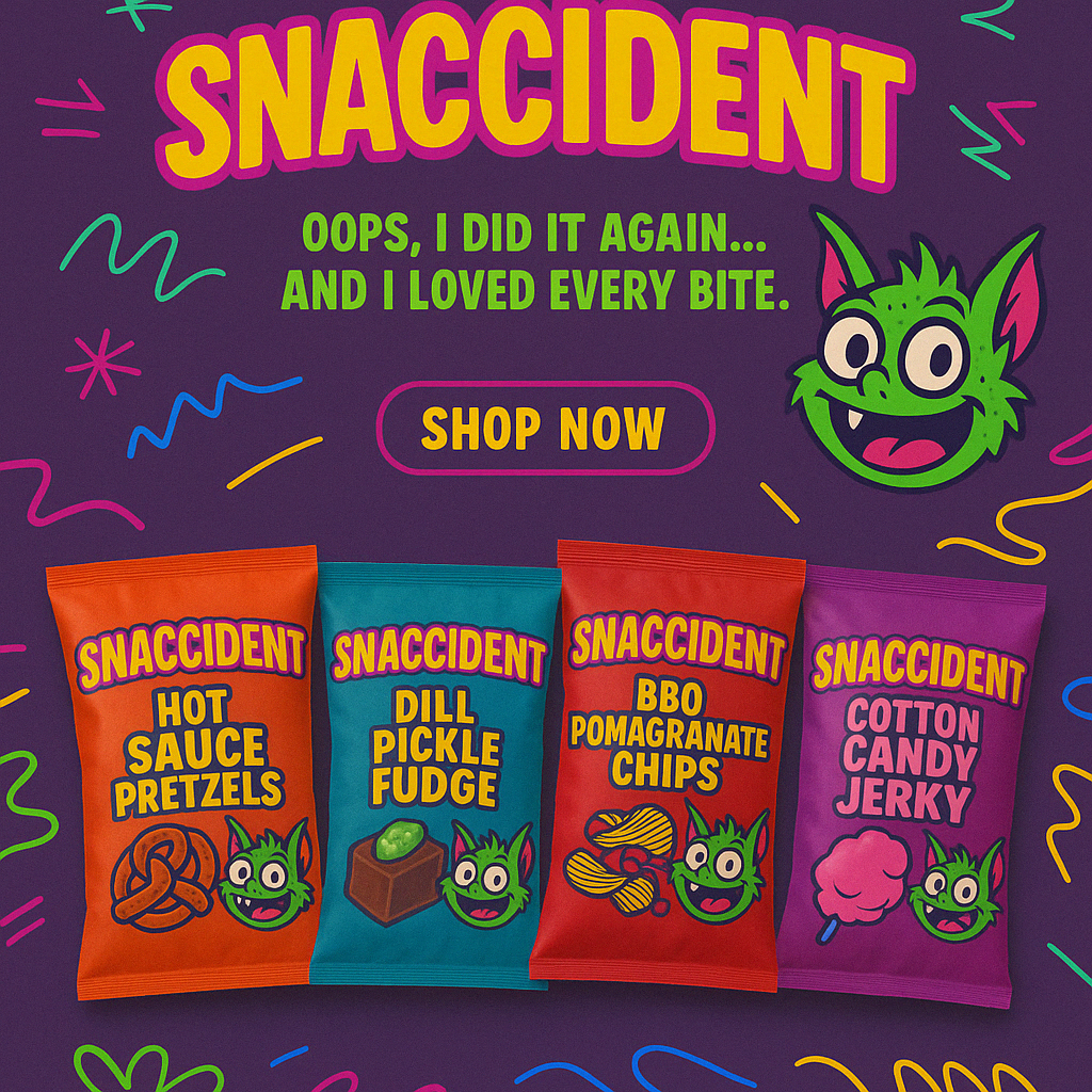
Oops, we did it again… and we loved every bite.
When SNACCIDENT approached us, they didn’t want just another snack brand. They wanted a neon-splattered, rule-breaking, flavor-smashing brand that screams chaos and tastes like a dare. Naturally, we said hell yes.
From day one, it was clear: this wasn’t a polite nibble-and-smile kinda gig. This was a midnight snaccident, a full-send into the world of chili chocolate popcorn, pickle cotton candy, and wasabi caramel that somehow (magically) works.
We kicked things off by digging deep into their why — impulsive indulgence, fearless flavor, and absolute snack anarchy. That gave us the blueprint for everything that followed.
The Palette: Loud, Proud, and Slightly Unhinged
We built a color palette that doesn’t whisper—it shouts. Neon pinks, electric yellows, radioactive greens, and punchy purples crash together like a rave in your mouth. Every tone was carefully chosen to make their shelf presence scream “pick me, I’m unhinged and delicious.”
The Logo: Mischief in a Font
The SNACCIDENT logo had one job: be unforgettable. We paired chunky, unapologetic lettering with a grinning gremlin mascot who lives for flavor crimes. It’s chaotic good. It’s “oops” energy in a typeface. It’s exactly what the brand needed.
The Concept Designs: Taste the Mayhem
From pickle cotton candy to dill fudge and cotton candy jerky, we brought the madness to life with packaging that’s wild, weird, and instantly craveable. Each pack explodes with color, humor, and attitude—because that’s how SNACCIDENT rolls.
This was more than a branding project—it was a full-on flavor revolution. SNACCIDENT gave us creative freedom, and we returned the favor with a brand that breaks every rule in the book… and eats it.
Brand weird. Snack loud. Be a snaccident.