

Brand Name: Frame Haus
Tagline: Where Vision Finds Structure
Client: Frame Haus — Creative Production Studio
Brand Overview:
Frame Haus is a high-end creative production studio specializing in visual storytelling — from cinematic video campaigns and fashion photography to branded content and architectural videography. With clients ranging from luxury fashion houses to contemporary design firms, Frame Haus merges bold creativity with structured execution.
Based in Berlin and expanding globally, the name "Frame Haus" is a nod to both its architectural roots and its role in shaping stories through carefully constructed visuals — framing not just scenes, but entire narratives.
Design Concept:
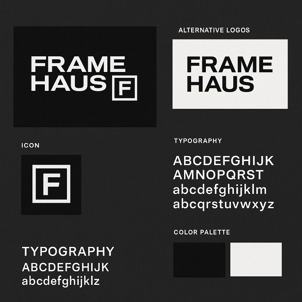
When designing the Frame Haus identity, we focused on precision, clarity, and minimalism. The brand wanted to express confidence without being loud, and sophistication without being sterile.
The clean, all-uppercase sans-serif typeface reflects the brand’s structure and technical finesse, while the slight weight variation adds visual interest and modernity. Splitting “FRAME” and “HAUS” into two lines introduces balance and gives the logo a strong, grounded presence.
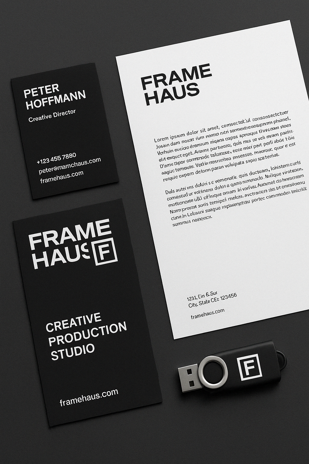
The boxed “F” icon was crafted to act as a stand-alone emblem — easily adaptable across digital assets, watermarks, production slates, and branded merchandise. It represents both a literal frame and a symbol of creative focus. The enclosed form feels architectural, echoing a camera viewfinder or gallery wall.
Design Process:
We began with keyword mapping: structure, storytelling, clarity, minimalism, confidence. From there, we explored Bauhaus-inspired grids, clean Swiss typography, and contemporary studio aesthetics. The client wanted a monochrome palette to ensure the brand worked across light and dark media, film credits, and business documents.
The final design reflects a deliberate intersection of creative expression and visual order — the essence of what Frame Haus brings to its work.
