

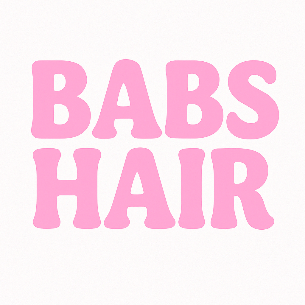
BABS HAIR LOGO DESIGN
Client: Babs Hair
Location: Dolly Beauty, Chester, UK
Industry: Hair & Beauty
The Brief:
Babs is a powerhouse. A self-employed hairdresser working out of Doll Beauty in Chester, she came to us with a clear mission—build a brand that reflects her bold personality while tying her unmistakably to the Doll Beauty empire she reps and adores. She didn’t want to just fit in—she wanted to stand out while still feeling like part of the Doll family.
The Goal:
Create a logo that’s fierce, feminine, and immediately recognizable. It had to echo Doll Beauty’s signature style while carving out a space that’s unapologetically Babs. We’re talking pink, punchy, and packed with personality. This wasn’t about blending in—it was about amplifying connection and owning the vibe.
Our Move:
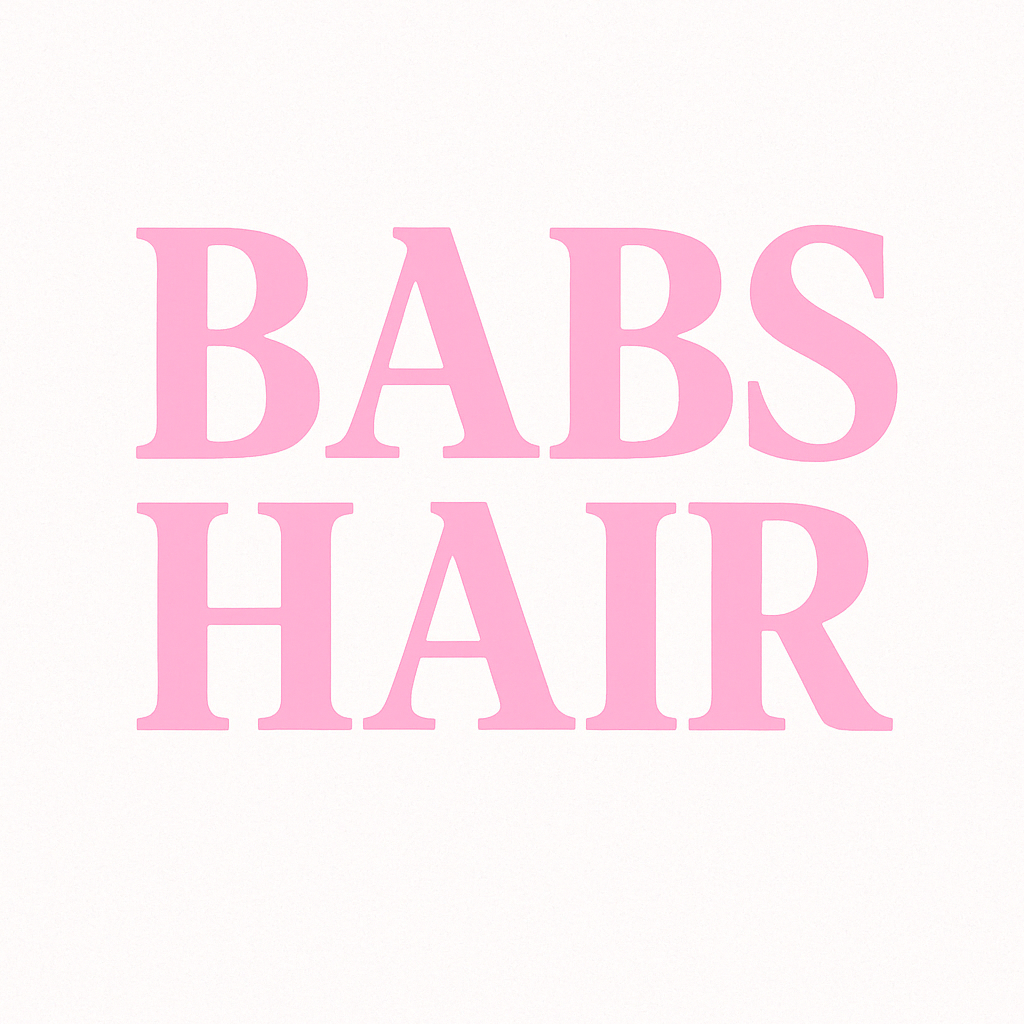
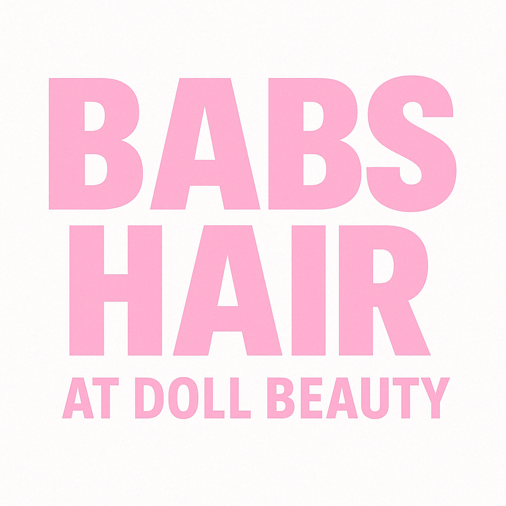
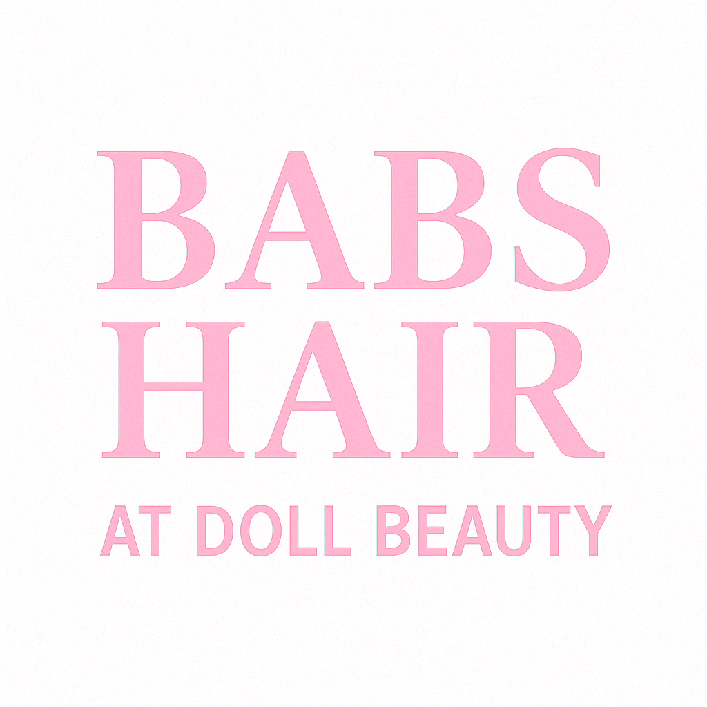
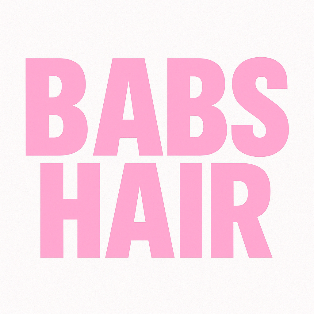
We delivered a logo that hits hard and looks damn good doing it. Bold block letters in bubblegum pink, backed by clean, confident typography that mirrors Doll Beauty’s branding while giving Babs her own spotlight. The “AT DOLL BEAUTY” line grounds her within the brand she loves—so her clients know exactly who she is and where she’s rooted.
The Result:
A few different designs. They’re Bold. They’re Beautiful. And They’re all Babs. These logos aren’t just designs—they’re a statement. they say: I’m here, I belong, and I bring the glam. From salon floor to Instagram feed, Babs is instantly tied to the brand she believes in—without losing an ounce of her own shine.
Take a look at her Instagram page: Here
Babs Hair at Doll Beauty. Branded. Connected. Unmissable.