
NESTWORK: A Bold New Vision for Collaborative Workspaces
When we were approached by NESTWORK to design their brand identity, we knew we were working with a game-changer in the world of co-working. Their concept was simple yet revolutionary: a collaborative space that was not just a desk to rent but a sanctuary for innovation, connection, and productivity.
The goal was to create a brand that reflected the future of work: dynamic, flexible, and community-driven. But we needed to make it bold—something that stood apart in a sea of sterile, corporate spaces. The NESTWORK brand isn’t just about workspaces. It’s about freedom, creativity, and empowering individuals and teams to thrive in a modern environment.
The Logo: From Concept to Creation
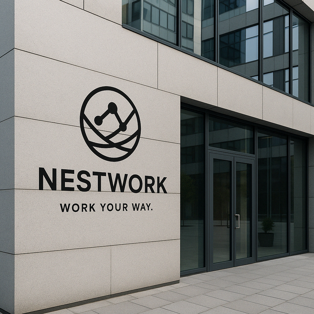
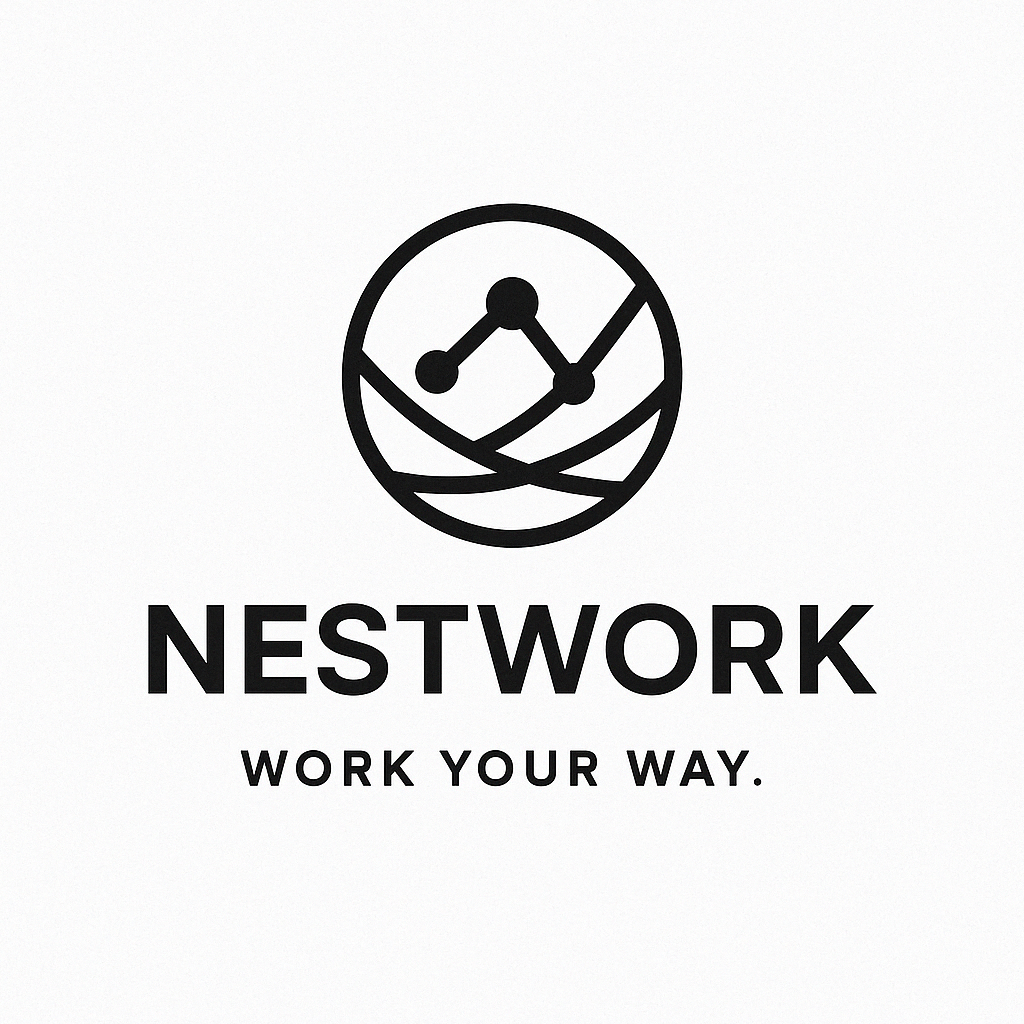
The logo is a visual representation of connectivity, flexibility, and the feeling of being grounded while soaring to new heights. We drew inspiration from the natural world—a nest that’s home to ideas, a place where people come together to create, collaborate, and grow.
The geometric nest symbol—comprising clean, interwoven lines and connected nodes—embodies the web of collaboration and innovation NESTWORK aims to foster. We balanced that with a sharp, modern sans-serif typeface to communicate a no-nonsense approach to the future of work.
This isn’t just a logo; it’s a statement. It’s sleek, it’s strong, and it’s unforgettable—just like NESTWORK itself.